An effort in finding words for what Boris Ondreička calls Secondary Contemporary. Purely abstract art is a good training in art writing, he advises. I have no intention in establishing myself as a commentator on art, however, I do have intentions regarding testing the limits, just for theoretical and aesthetic purposes.
He also said somethings about circumventing around art, not really prescribing it but circling it. He mentioned negative form in ceramics or sculpture, where you take things out from a block of soil, and that negativity shapes what the thing sets out to be.
That I understand. But he also said somethings about three dimensional writing which I have no clue whatsoever, and at that point, I don’t even know if we should continue forcing the medium of language to self transcend, or just to find something new, as a medium, already.
Anyhow, I chose Agnes Martin. Not quite sure if I am testing the boundaries here, but at leat I am writing. Halfly done, less than half portion content with the result.

Looks like something that occured naturally, but also as something a human constructed. Mirrors a life happened, is a part of an engine that also witnessed a life on the happening. Somewhat brings out familial feelings, like a machine, a house servant, a sunday spent with cleaning. But also embroidery, knitting, femininity domesticated. Squared. Yet it not being symmetrical shows somewhat docile creativity, which gives the impression that it can burst out any minute. It comes off as a solid object itself, not a representation of anything, but it being an object, a something something. Perhaps a misused lid, or a cover, better, a camera lid, when taken off, shows us the world in its most raw form. In that sense, a milisecond before the start of a home recording.


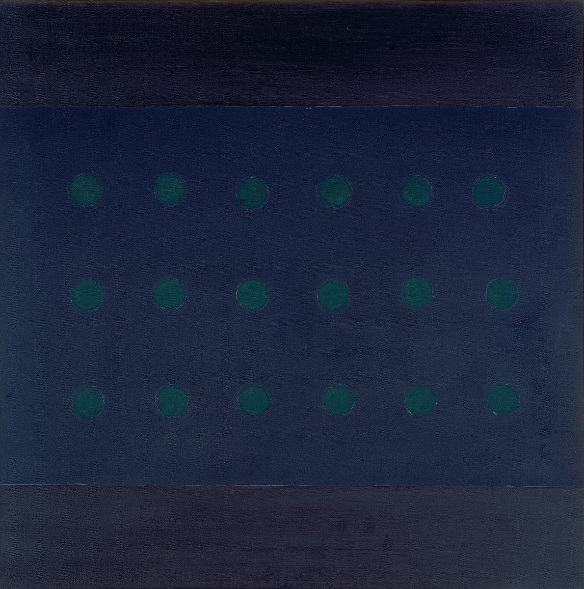
I have no idea what to call them. Perhaps judging them separately would be better for an amateur like me, but amateurs are what they are due to their laziness in the first place, and I got lazy when I saw these two. I can say though that the color use here makes them more 2-D. Even if the holes are for me, holes and not just circles, the stickiness of the front layer to the back makes me think of loss. Yes, loss, the loss of one of your dimensions which is the situation that happened for them. How does one lose one of their dimensions, and furthermore how, as an artist, you make such a loss (which is a process, once finished, is itself lost) apparent on canvas? Perhaps the answer lies here, the slight change of color in the first, and the two toned blue which makes the sky blue look like a patch glued on the other, allows for the viewer the process, the history in the making. There is also a question of size: In the first, the front is equal in size to its back layer whereas for the second there are two competing types of domination. The front is dominating by being fully visible and is dominated by being smaller.

There is something I like about this environment, it feels calm and steady. The yellow sitting places totally collect the attention, and in that way confirms to the definition of being in the centre. I like the calmness that spreads from the soft blue of the canvases on display, they now seem like horizons of the open sea, and I, an aimless passenger.
Tell me, is this art critique or is this just literature commenting on its source of inspiration? I have yet to know the differences…
Find Boris Ondreička’s essay on second contemporary here: https://tripleampersand.org/ad-hoc-the-next-contemporary
Bir Cevap Yazın